1
/
of
2
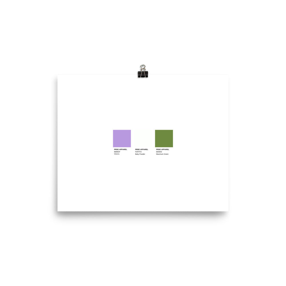
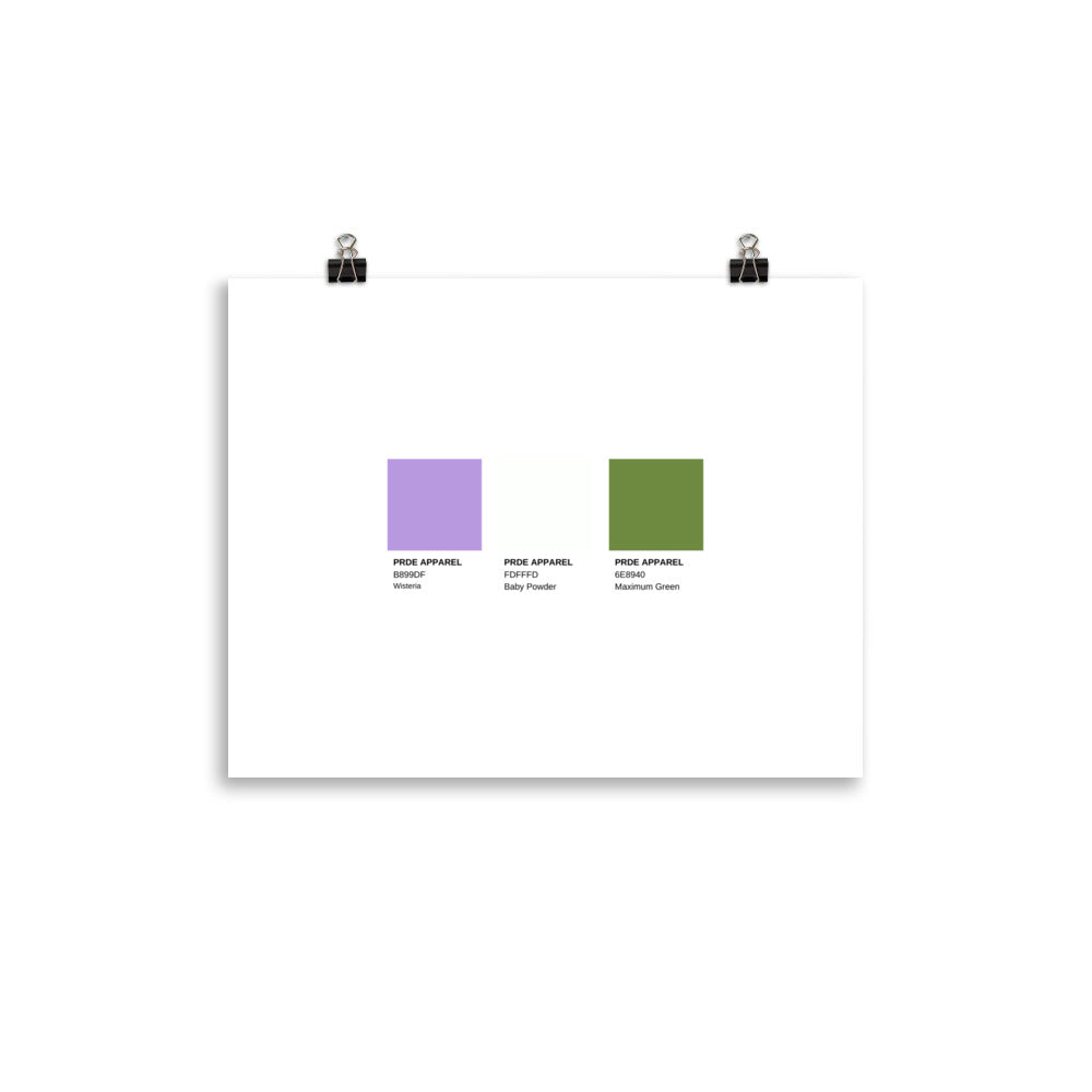
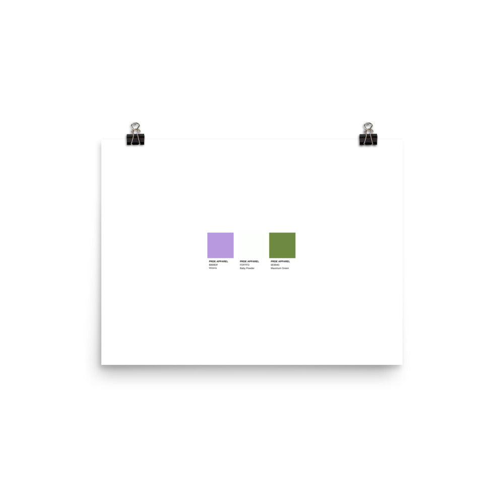
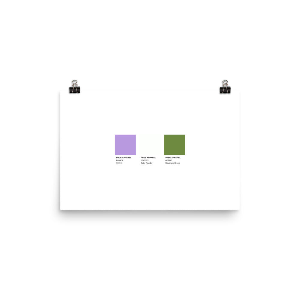
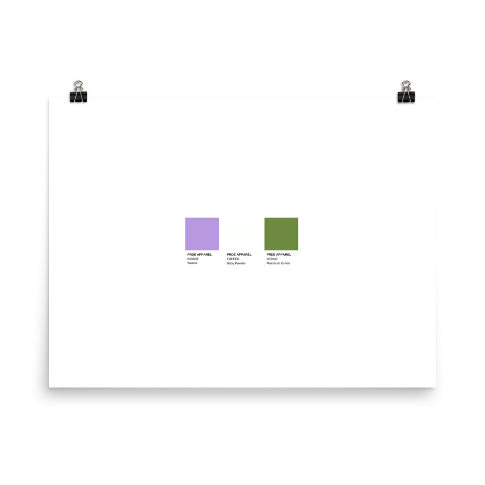
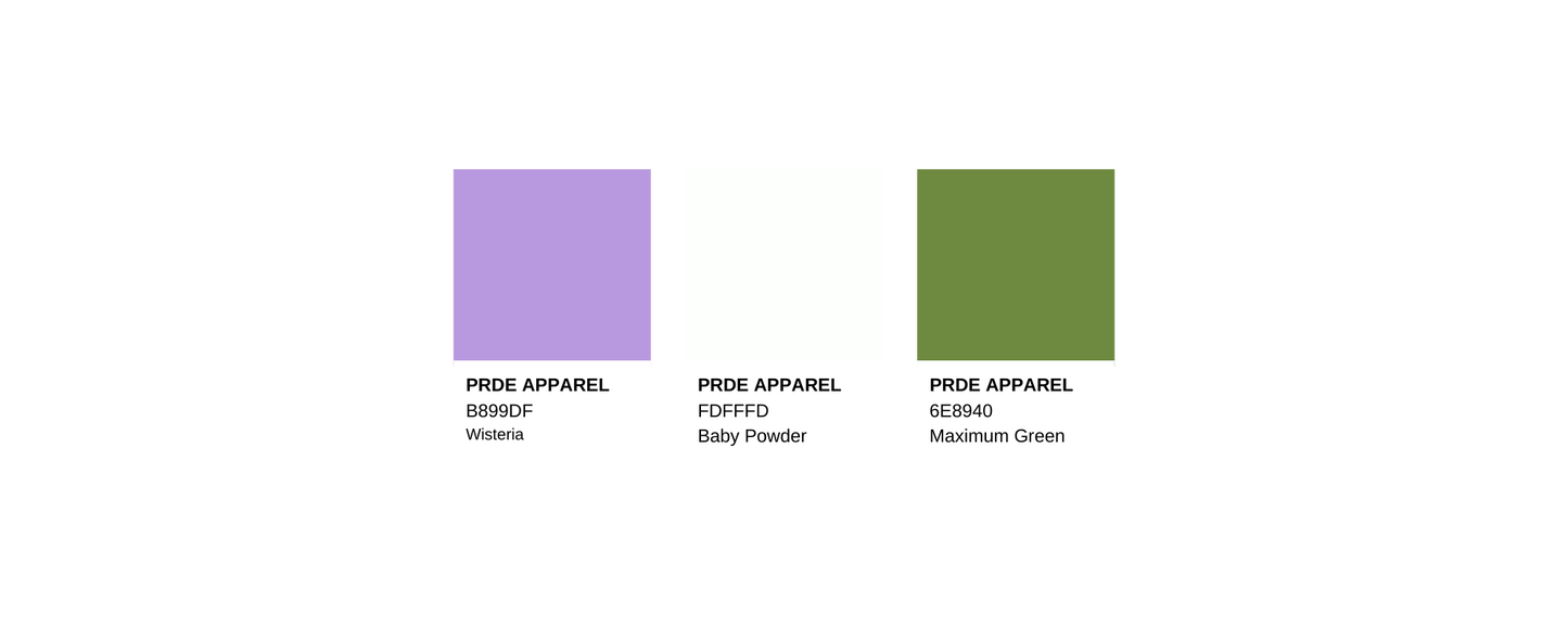
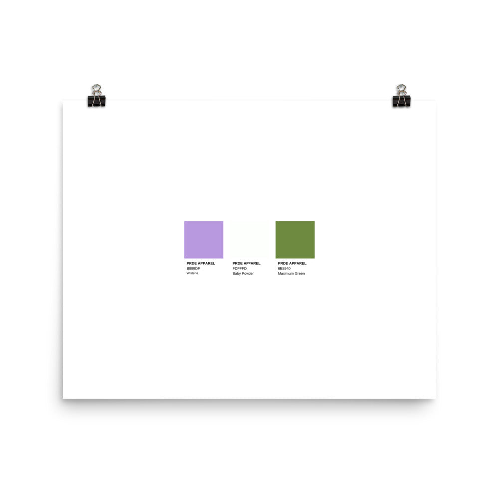
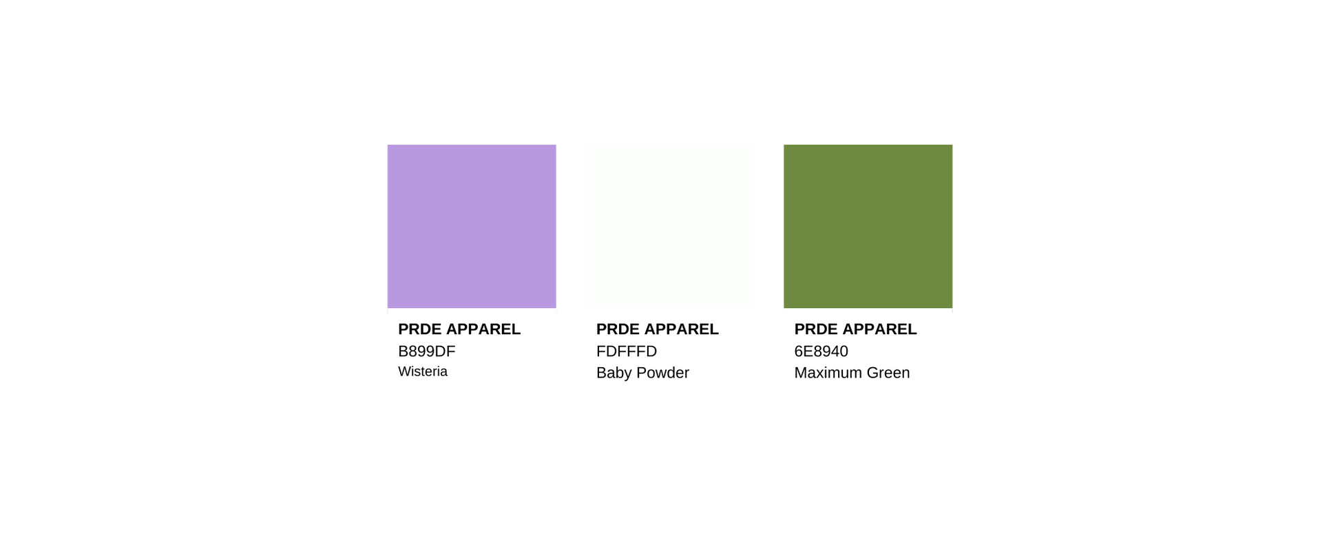
Genderqueer Paint Swatch Poster
Genderqueer Paint Swatch Poster
Regular price
$20.00 CAD
Regular price
Sale price
$20.00 CAD
Unit price
/
per
Couldn't load pickup availability
This print is a minimal and chic way to elevate your space. The artwork stands out from any angle as the matte museum-quality paper diffuses the light.
The flag for the Genderqueer community was created in June 2011 by Marilyn Roxie in order to create visibility for the genderqueer community and related identities. The flag was originally intended to represent all non-binary and genderqueer folk, but as the genderqueer community grew the flag became synonymous with "genderqueer" specifically, leaving many non-binary people to not feel represented by the flag. Which lead to the creation of the non-binary flag.
For this flag, lavender, which is a mixture of "blue" and "pink", represents androgyny, and people who identify as a mixture of female and male. White represents agender people and the dark chartreuse green, the inverse of lavender, represents people who identify outside of and without reference to the gender binary.
This product is made especially for you as soon as you place an order, which is why it takes us a bit longer to deliver it to you. Making products on demand instead of in bulk helps reduce overproduction, so thank you for making thoughtful purchasing decisions!
Donations
Donations
We donate 5% of our profits on our products to local Canadian LGBTQIA+ resource centres.
Highlights
Highlights
• Paper thickness: 10.3 mil
• Paper weight: 5.57 oz/y² (189 g/m²)
• Giclée printing quality
• Opacity: 94%
• ISO brightness: 104%
Share
